Design Quality Dashboard
Designed a dashboard that helped product teams identify and prioritize design system implementation gaps across Facebook Business Suite.
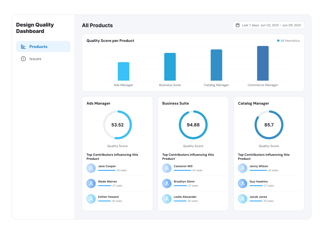
Design quality is inherently subjective. From accessibility to aesthetics, it spans multiple dimensions that require different types of evaluation. The Ads Business Platform (ABP) Design Systems team needed a way to assess usability across Facebook Business Suite surfaces and track how design system guidelines were being implemented by product teams. While teams knew the principles, they struggled to translate them into consistent design decisions across surfaces.
I helped turn those guidelines into a tool that made design quality visible, understandable, and measurable.
Turning design foundations into a measurable system
A strong design system depends on foundations that define how it works, scales, and is maintained. From core principles to individual components, these foundations guide design and development decisions. The ABP team had these foundations, but implementation was inconsistent, which created uneven usability across Facebook Business Suite. Although the quality guidelines were meant to raise the design bar, they were difficult to apply consistently in practice. Teams worked across different surfaces and product areas, with no shared way to evaluate whether a surface was improving or regressing. The design challenge was not only defining what “good” looked like, but making the current state clear enough for teams to decide where to act.
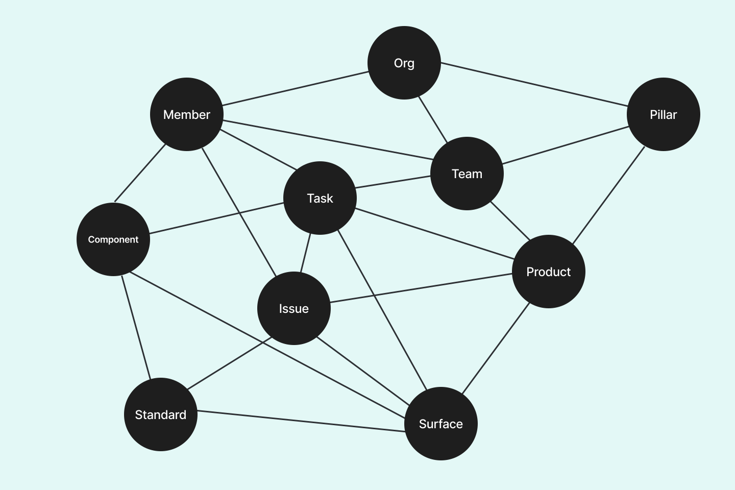
This diagram shows how teams, product surfaces, and quality issues are connected.
One of the biggest challenges was making the dashboard actionable. To do this, the Design Quality team defined a Design Quality Score that summarized the overall quality of a surface while also exposing the component-level breakdown behind it. This helped teams understand what was driving each score and prioritize improvements. The score evaluated location, accessibility, clarity, ease of use, and aesthetics. It was calculated from component-level evaluations based on design system rules and guidelines.
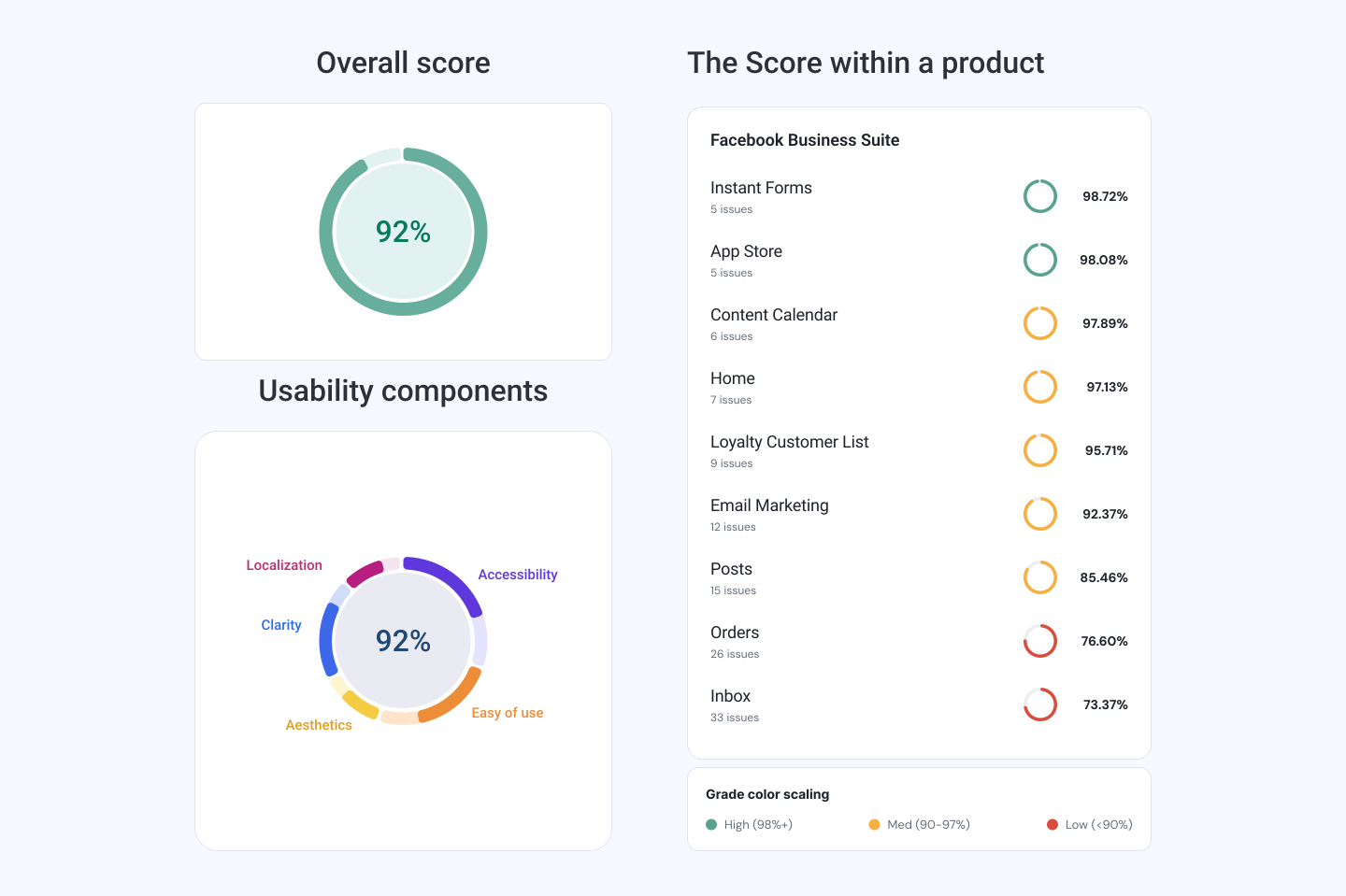
The overall score gave teams a quick, shared view of a surface’s quality and surfaced the usability dimensions driving the result.
The dashboard also showed the number of issues found, issue severity, and the number of components evaluated per surface and team. This mattered because the dashboard was not only a reporting tool. It needed to create shared understanding at the platform level so designers, product teams, and stakeholders could align on quality improvements.
Designing for clarity and comparison
A big part of the experience was making complex design quality signals easier to understand. I explored data-visualization patterns that could help teams quickly compare surfaces and evaluate tradeoffs without losing the nuance behind the score.
I tested early concepts around doughnut charts and bar-based comparisons to find the right balance between:
- Clear visual hierarchy.
- Fast scanability.
- Enough context to explain the score.
The final direction focused on making the dashboard easy to scan, while preserving enough detail for teams to understand why a surface scored the way it did.
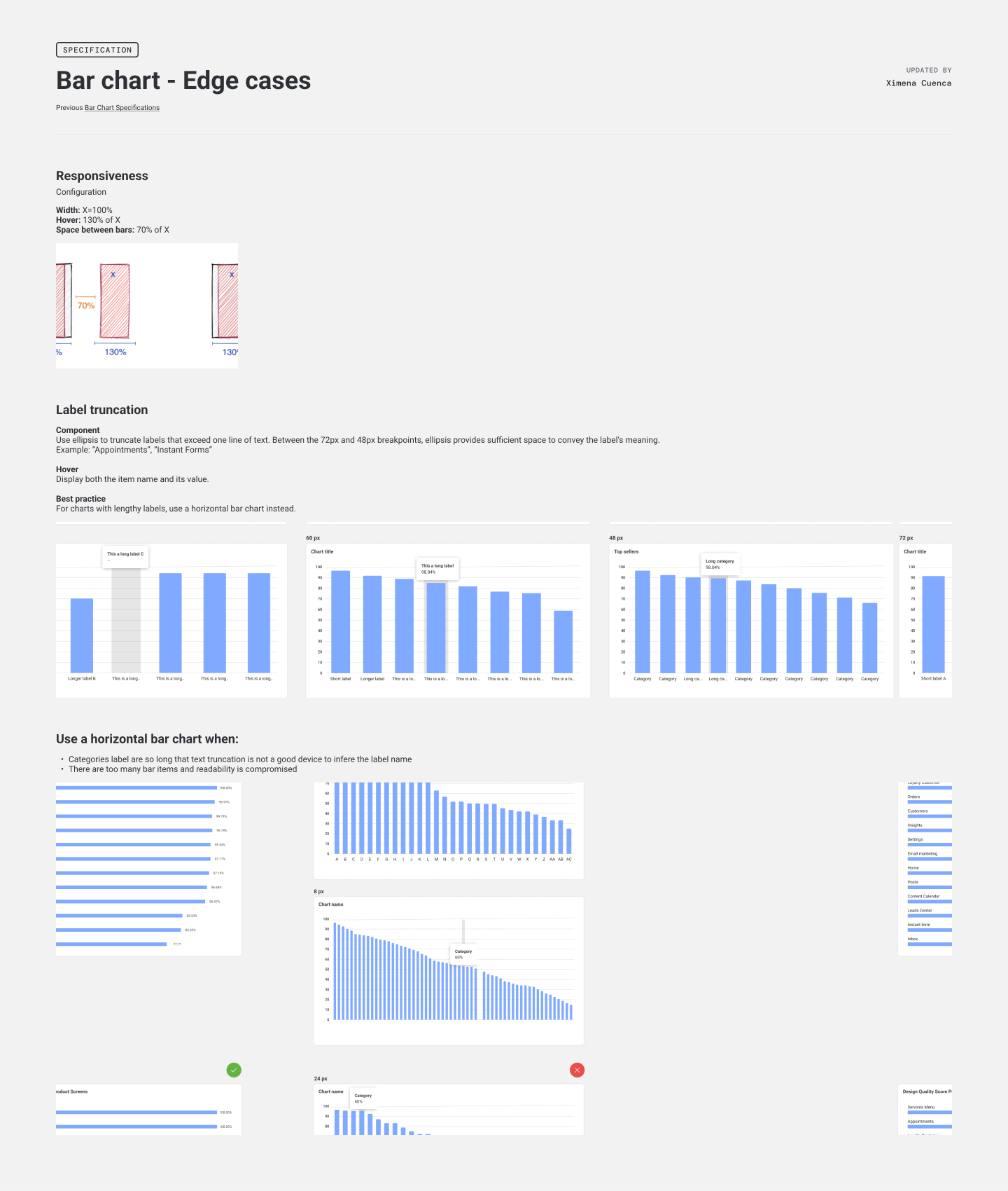
A spec page documenting responsive behavior and label truncation rules for the bar chart component, an edge case the existing design system hadn’t yet defined.
Translating principles into action
The result was an MVP dashboard that helped teams:
- Understand their current design quality score.
- Review the core usability components that influenced it.
- Compare quality across surfaces within a product or organization.
- Identify where to focus remediation efforts.
The experience made design quality feel less abstract. Instead of relying on broad guidelines, teams could see a clear snapshot, understand what contributed to the score, and use that to prioritize improvements.
A walkthrough of the MVP, bringing the quality score, usability components, and product-level views into one place.
What stood out most about this project was not only designing a dashboard, but clarifying which factors shape experience quality. Translating qualitative design principles into measurable signals was useful, but it surfaced a key tension: much of what the Design Quality Team wanted to measure was closer to a user experience evaluation than to design system compliance. Scoring surfaces, similar to how a linter scores code, works well for structural consistency. However, usability and clarity are harder to reduce to a single number without losing meaningful nuance, and aesthetics remains inherently subjective.
This MVP did not reach a final shipped version, but it was a valuable exercise in understanding where quantifiable design system rules end and qualitative UX criteria begin.
Project credits
- Team: Design Quality Score team (developers, product managers, and product designers).
- My role: End-to-end flow design, dashboard design, concept prototyping, and design system contribution.