Credit card online application
Redesigned a 52-field credit card form using a risk-based framework, doubling the top-of-funnel applicant volume post-launch.
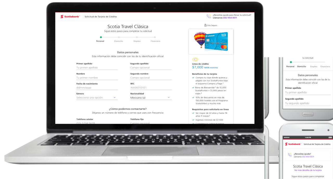
Scotiabank Mexico’s credit card application was one of the bank’s first digital experiences as it moved toward digital transformation. Opening a digital channel where customers could apply for a credit card online was a major step forward, since the bank had previously only offered applications in physical branches. Working with the digital product and retail teams, I had to understand the prerequisites, risk assessment, and approval process so we could prevent fraud and avoid automatically approving applicants with a high-risk profile.
In this case study, I’ll walk through the challenges behind the project and how, as a designer, I worked with UX Research, Product Managers, Developers and other teams across the bank to understand the risk framework, identify the main pain points in the process, and map a funnel that connected online and offline evaluation points.
The application people started but rarely finished
The first version of the form had a problem from the start: applicants were beginning it but not finishing. The credit card application listed 52 text fields in an accordion layout, with six sections locked until the previous one was completed. From a user experience perspective, the form was long, and the accordion created a sense of an endless process, which discouraged applicants from complete it.
At the same time, the bank had business goals to meet as it invested in its digital transformation and worked to increase the number of active customers, including credit card holders. So the UX challenge was not just about improving the usability of the overall experience, but about making it work within the bank’s compliance and risk requirements.
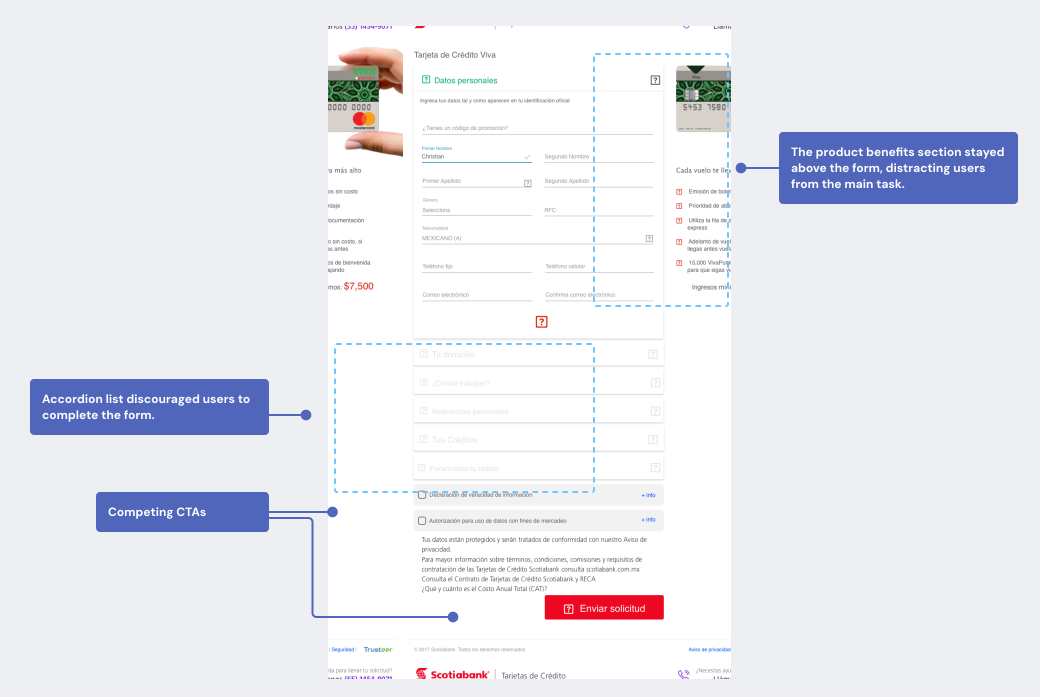
The original accordion flow increased cognitive load and hid progress, especially on mobile.
Mapping the funnel to find where applicants dropped off
The funnel analysis showed that of the 627,000 users who started the online application, only 33,800 completed it, which represented a 94.6% drop-off. By contrast, conversion from Completed through Activation remained relatively strong, confirming that the main friction was almost entirely in the application form itself. Because the application was structured as an accordion-style form that didn’t track completed sections by URL, there was no clear way to know which sections were causing the most friction. However, by correlating the accordion format with completion rates by device (61.76% on mobile versus 35.29% on desktop), I was able to formulate the following hypotheses:
- Users needed a shorter, more granular application, optimized for mobile devices and easy to complete.
- The product team needed a better system for measuring form completion in order to understand the biggest points of friction.
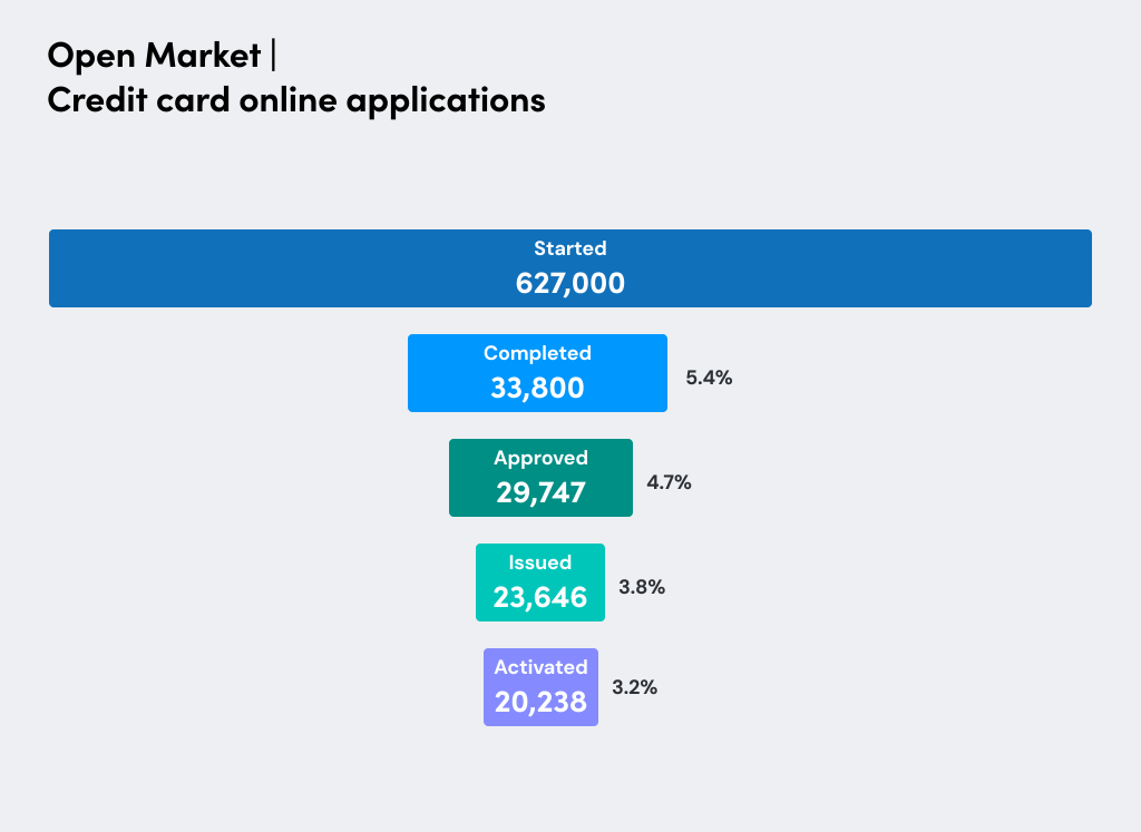
Credit card application sales funnel showing drop-off rates at each stage.
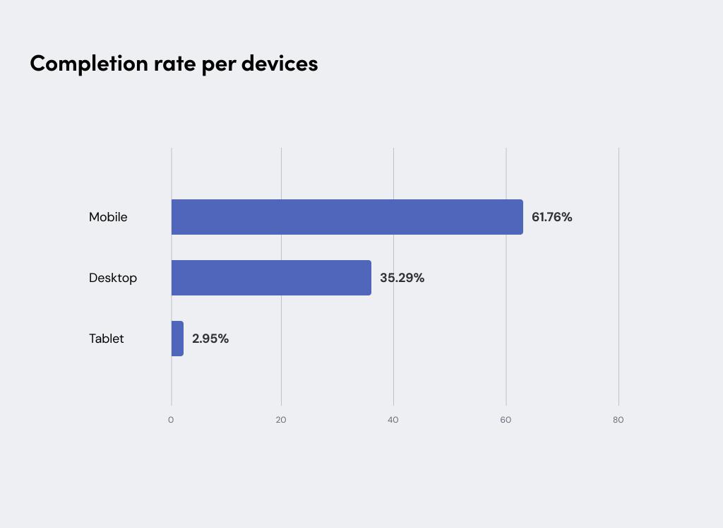
Most traffic came from mobile, but desktop converted better, signaling mobile-specific friction.
Working closely with the Credit Cards Risk team and UX research peers, I mapped the application process through several workshops with cross-functional partners from digital and retail banking, including engineering. The outcome of those workshops was a process flow that revealed something important: not all applicants needed the same amount of information, and those applicants with a strong credit history could be approved with far less data.
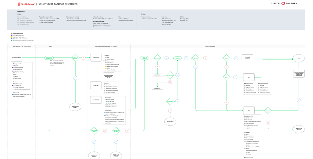
The process flow aligned risk and UX constraints and defined how applicants moved through approval paths.
This led us to the core solution: a risk framework that routes applicants into different form lengths based on three key questions and their credit history. From there, I mapped the user flows and drafted the information architecture for both paths.
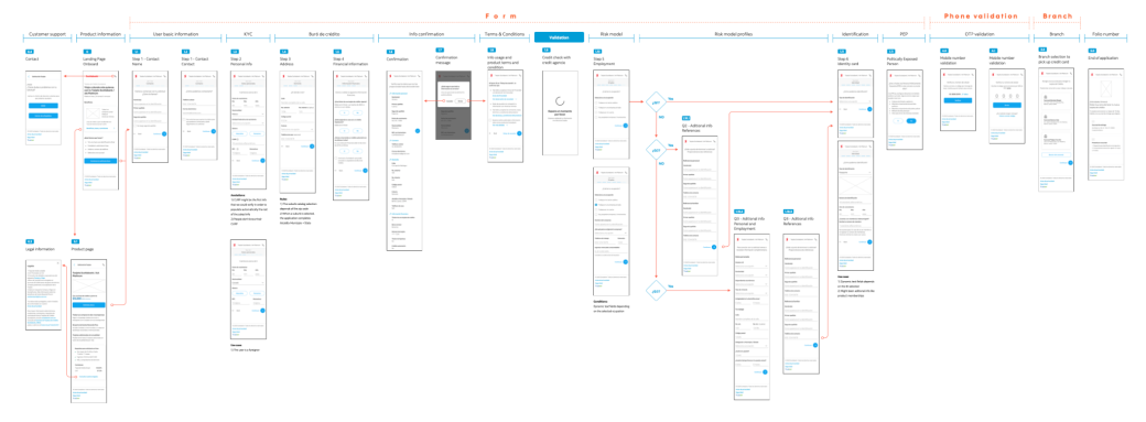
User flows and blueprints translated the risk model into clear, step-based interactions.
Optimizing the application form
The redesigned application splits into two paths: lower-risk applicants complete a four-step, 24-field form, while higher-risk applicants go through the full 52-field form, organized into clearer steps.
Three design decisions supported the new flow:
- Stepper navigation: A step progress indicator at the top of the application replaced the accordion, giving users a clear sense of how many steps remained and reducing anxiety about finishing. Each step also had its own URL, which gave the product team visibility into exactly where drop-offs occurred and helped separate UX friction from risk-assessment constraints.
- Product benefits: The benefits block was moved below the form header and made accessible via a link, so it no longer buried the form on mobile.
- Branch locator: Once approved, users could select the nearest branch by zip code to pick up their debit card.
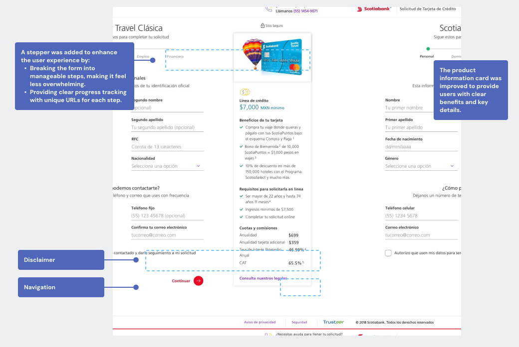
Final design for the credit card application, with a four-step indicator and clearer information hierarchy.
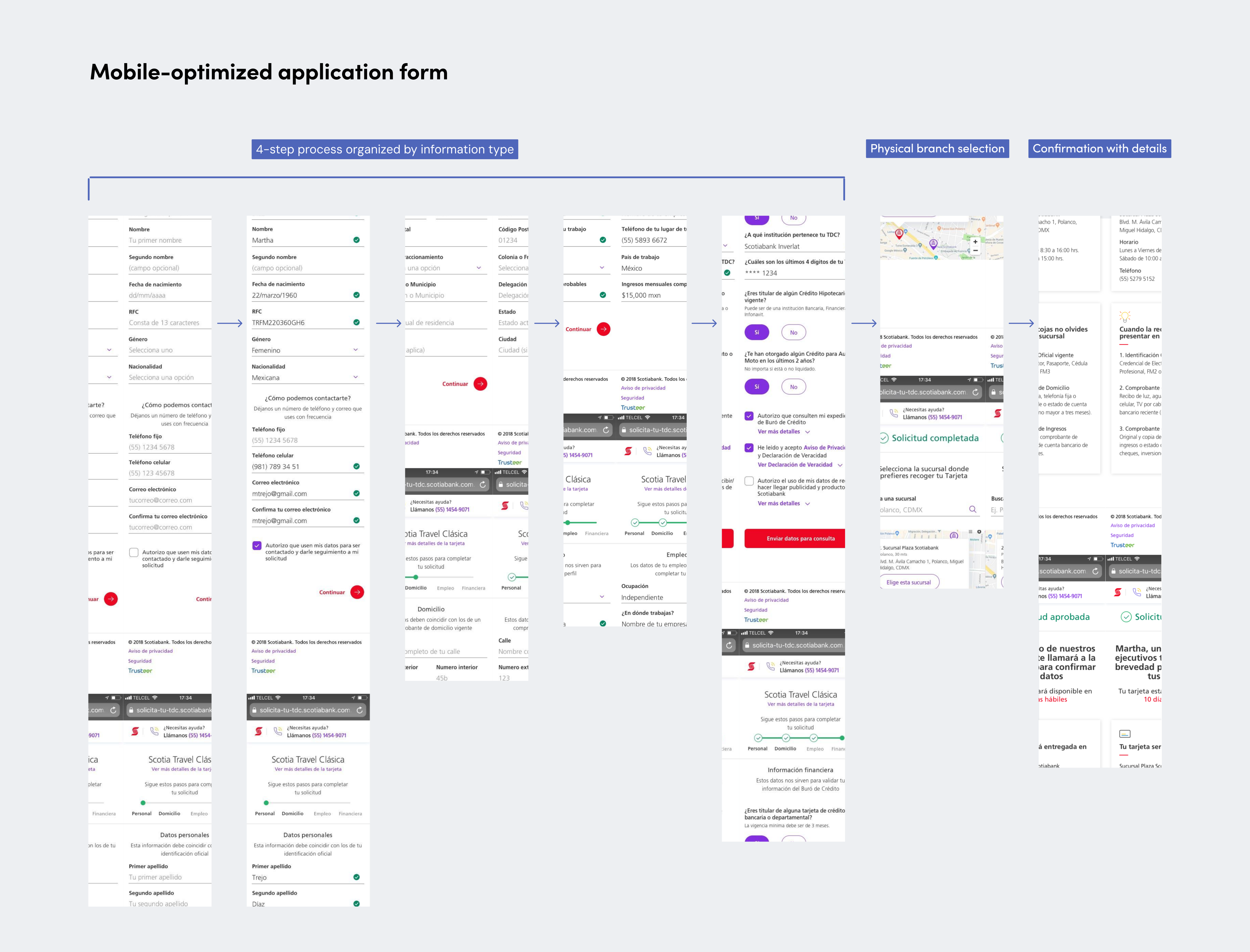
Final design for the mobile-optimized credit card application form, including a four-step flow, branch location, and a confirmation message.
Impact
The redesigned application launched in 2018. Applicants starting the form grew from an estimated ~350k pre-redesign to 790,592 in Q1 2019, more than doubling top-of-funnel volume within the first comparable period after launch. By September 2019, cumulative starts for the year had reached 3,778,408, reflecting a ~59% increase in average monthly volume compared to that initial post-launch quarter, evidence that growth continued to accelerate rather than plateau. The URL-per-step structure also enabled a more precise sales-funnel analysis, helping the team pinpoint which drop-offs were UX problems versus compliance and risk-model constraints.
The most valuable lesson from this project was that redesigning an online application was about more than rethinking a form. It was a real UX problem because users needed to complete it quickly and with confidence. It was also valuable to understand the credit card application as a system that connects Know Your Customer (KYC) policies, risk models, fraud controls, and customer service. By starting online and then moving qualified applicants to a physical branch, the experience became more efficient for customers and saved them time in the process.
Project credits
Team: Credit Cards scrum (digital banking) and Credit Cards Risk & Fraud (retail)
My role: UX Designer, Content Design and Design system contributor